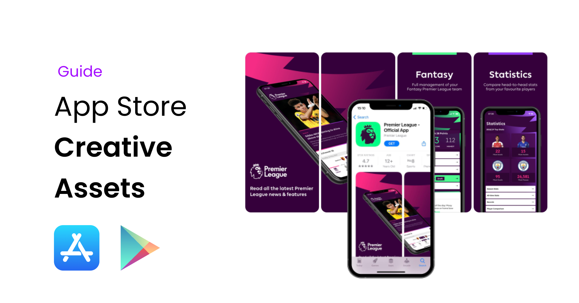
Ultimate Guide for App Store Creative Sets

It's common knowledge that beauty attracts the eye. In this short guide, you will learn about optimizing App Store visuals and the reasons for doing so.
Presentation Matters
Let's get straight to the point - first impressions matter. To back up my arguments with data:
- Good first impression increases conversion by 35%
- App video can increase installs by over 25%
- 50% of users drop-off within 6 seconds
- Average decision time is just 3 seconds
- 60% of visitors don’t scroll beyond first impression
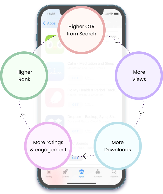
These data points tell us that we need to create eye-catching App Store assets. Pretty app product listing pages get more views, more downloads, better star ratings and rank higher. This is a self-fulfilling cycle that starts from a presentation.
The Optimization Formula
Before learning how to optimize individual App Store creatives, let's reveal the formula.
App ranking is a product of multiple different factors, which differ in significance and impact on the overall position. I will concentrate only on the factors to do with creative assets and leave the title, area under retention curve and similar non-creative ranking signals alone.
Example
Let's imagine the user funnel. User searches for 'Amazon Forest' and Apple returns a list of apps. Out of all these apps, the user selects the best one (in their opinion). Once on the app page, they will either download it, or go back to select another, more suited app.
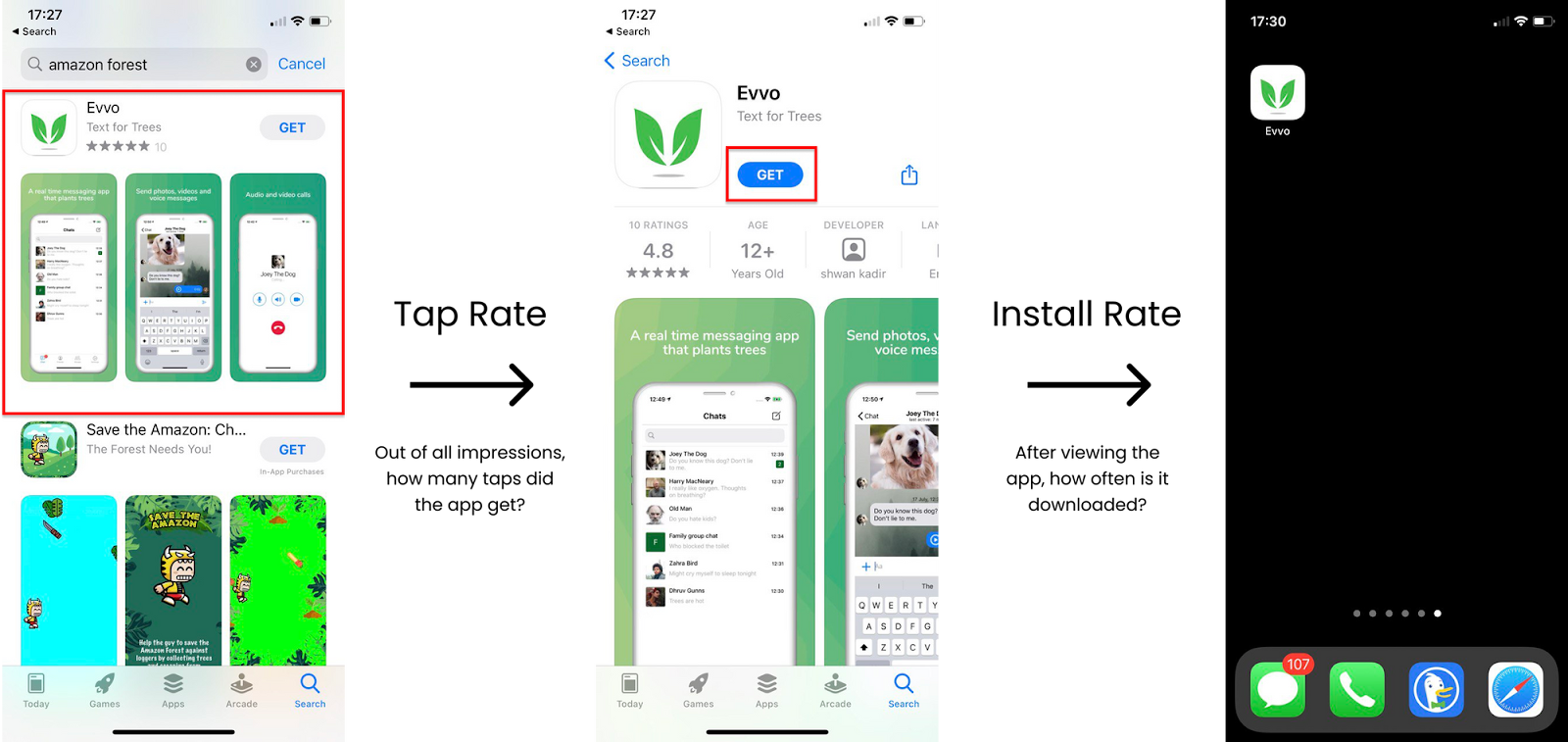
What are the decision points made by the user?
- Out of all apps, which one do I select? (Tap through rate)
- Am I happy to download and use this app? (Install rate)
** Each rank/position has it's own expected tap through rate and your goal is to beat it. For example, and app in position 3 getting 10% tap rate is much more impressive than an app in position 1 getting a 30% tap rate.
| Position | Expected Tap Through-rate |
|---|---|
| 1 | 28.38% |
| 2 | 6.15% |
| 3 | 2.66% |
Creative Optimization
Essentially, we would like to maximize both, the tap through rate (relative to what's expected from us) and install rate. To do so, you could create multiple variations of your creative assets and run an A/B test using Apple Search Ads.
Start with the User
Mobile apps generally have 2 types of users:
- Users that already know about your app and are visiting your App Store listing to download it.
- Users who visit your app page after searching for more general terms e.g. stopwatch.
Depending on the user type, the return on investment from your App Store optimization will differ. In the first case, your customers probably will not pay much attention to the design. However, if most of your customers are of the 2nd type, you should be investing into professional looking App Store visual assets.
Users will spend just a few seconds on your app page to make a decision whether to download or not, as well as compare you to the competition. Thus, you need to make sure that your creative sets stand out and align with user's search expectations.
App Store Creative Set
I will first cover the main App Store assets before sharing the optimization criteria at the end.
There are 3 things that you can optimize in your app store listing page:
- App Icon
- Screenshot Set
- Preview Video
App Icon
The app icon is the first item that the person sees - it is the face of your application. Try to make your logo match the search intent. Since you only 1 logo, let's make it count.
People are subconsciously attracted to text - consider adding text and keywords to your app logo.
Keep it simple - use consistent colours and match it with the rest of your visuals.
Stand out - if your competitors are all using the green colour, go for red. Unless they are using green for a specific reason e.g. 'Amazon Forest'.
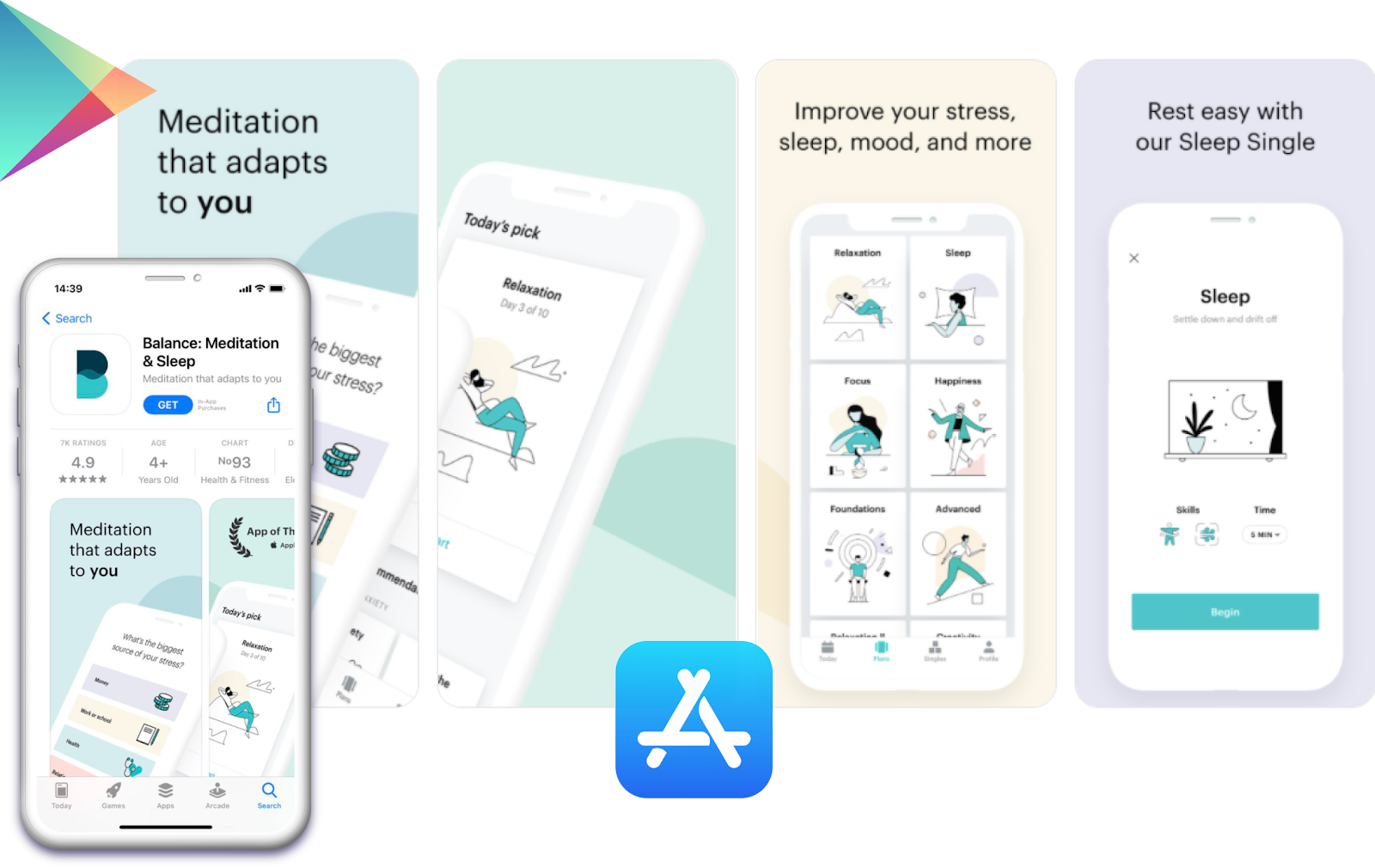
App Store Screenshots
Similar to the App Icon, App Store screenshots are used to demo and explain the purpose of the app.
We wrote a whole guide on how to create App Store screenshots, which I strongly suggest to check out. Below is the summary of key points:
- Frame your screenshots inside devices - this creates space for headings and makes the design look more complete & professional
- Avoid complex phone rotations
- Add short headings
Preview Video
App Preview is a short demo video (usually around 30 seconds) which helps to present your app.
Remember - App video can increase installs by over 25%. Similar to the screenshots, keep it minimalistic and easy to understand.
The majority of developers will skip this important optimization step. And as the idiom goes - one man's trash is another man's treasure.
Invest into adding the video - it will pay dividends long-term.
When making the video, refer to the preview video guidelines. Since Apple is quite picky with video format specifications, we made an App Store video preview maker to help you create, edit and automatically encode your preview into the format accepted by Apple.
Final Thoughts
To conclude, you should know have a better understanding of how the App Store ranking works and its' correlation with App Store creative sets. You should also be comfortable with the tools that are used to create all required App Store assets. Hopefully, the sources provided will guide you in the correct direction when doing further research.
Lastly, feel free to read more articles on this blog or checkout our Youtube channel for more how-to videos.